Flexbox Froggy is a fun and interactive web game designed to help developers learn CSS Flexbox – a powerful layout system for creating responsive web designs.
And in this article, we’ll discuss the solution of flexbox froggy level 24. So, let’s dive in!
If you’re eager to just grab the solution code and move on, here it is:
But hold on! If you’re like me and prefer to learn the ins and outs of the solution, let’s unravel the magic behind it.
Flexbox Froggy Level 24 Answer Explanation
We’ve nailed this level with just four lines of code, so let’s break it down step by step:
flex-direction: column-reverse;: We set the main axis direction as vertical, making the frogs stack on top of each other.flex-wrap: wrap-reverse;: This property wraps the frogs into a new row, starting from the opposite side (right to left), creating a reverse order.align-content: space-between;: The frogs’ rows are pushed to the extreme corners, leaving space between each row.justify-content: center;: Finally, we vertically align all the frogs in the center.
But hey, beyond just solving the level, let’s dive into the mindset and thinking that brought us to this solution. After all, mastering Flexbox is more than just completing levels—it’s about embracing a new design superpower!
The Thought Pattern Behind the Solution
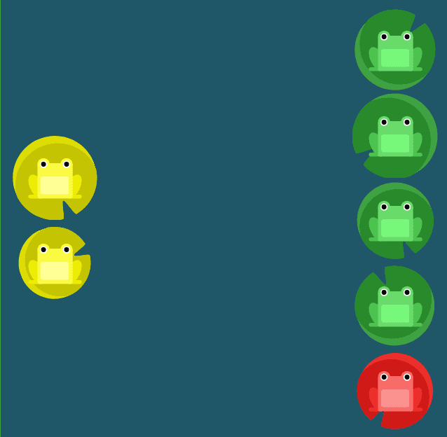
To conquer this level, we first observed the initial layout – six adorable frogs and six lily pads lined up vertically.
This pointed us toward using flex-direction in either column or column-reverse.
Knowing the red frog should end up at the bottom, we wisely chose column-reverse. Now, onto the next piece of the puzzle…
Seeing that we had two columns of lily pads, we knew the flex-wrap property was essential. However, selecting wrap would’ve given us the opposite arrangement—long column on the left, short on the right—definitely not what we wanted!
See:
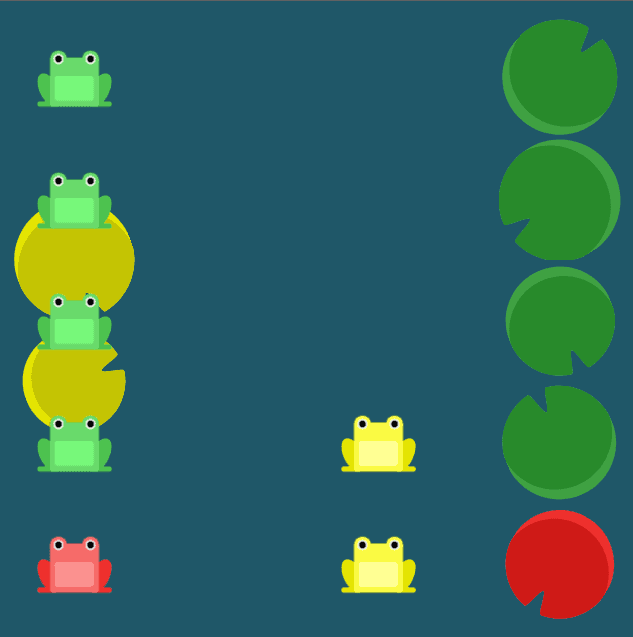
So, cleverly, we opted for wrap-reverse, resulting in the perfect froggy order we desired.
To have both columns of frogs rest comfortably on each end, we used the align-content property, setting it to space-between.
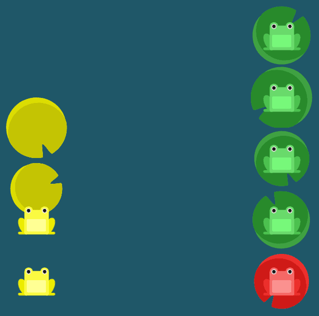
Lastly, we centered the frogs in the left column by enchanting them with the justify-content: center property.
Voila! That’s the secret to conquering Level 24 of Flexbox Froggy!
But wait, there’s more! Now that you’ve successfully completed all the levels, what’s your next move?
Here’s a fantastic idea—master those Flexbox and Grid tricks! I’ve got a free ebook just for you, titled “21 Clever Tricks using Flex and Grid.” It’s packed with invaluable knowledge to supercharge your designs. Download it here!
And if you’re hungry for even more, I’ve prepared an article covering answers for all the Flexbox froggy levels.
Remember, the key difference between an average developer and an exceptional one lies in the depth of understanding.
So, keep coding, keep exploring, and keep rocking the web!
