Flexbox Froggy is a fun web game that helps developers learn CSS Flexbox by helping their froggy friends reach the right lily pads. But as we know, understanding Flexbox is as simple as walking in the park during a hurricane.
That’s why I’m writing this article for folks like me who, every minute, go, ‘Wait, isn’t it supposed to align from right to left?’
So, here are all the possible Flexbox Froggy answers for all the levels of the game with proper explanations:
Flexbox Froggy Level 1
Answer Code:
Explanation:
First, know this: justify-content aligns the items on the main axis. Wondering what the main axis is? Check out this picture:
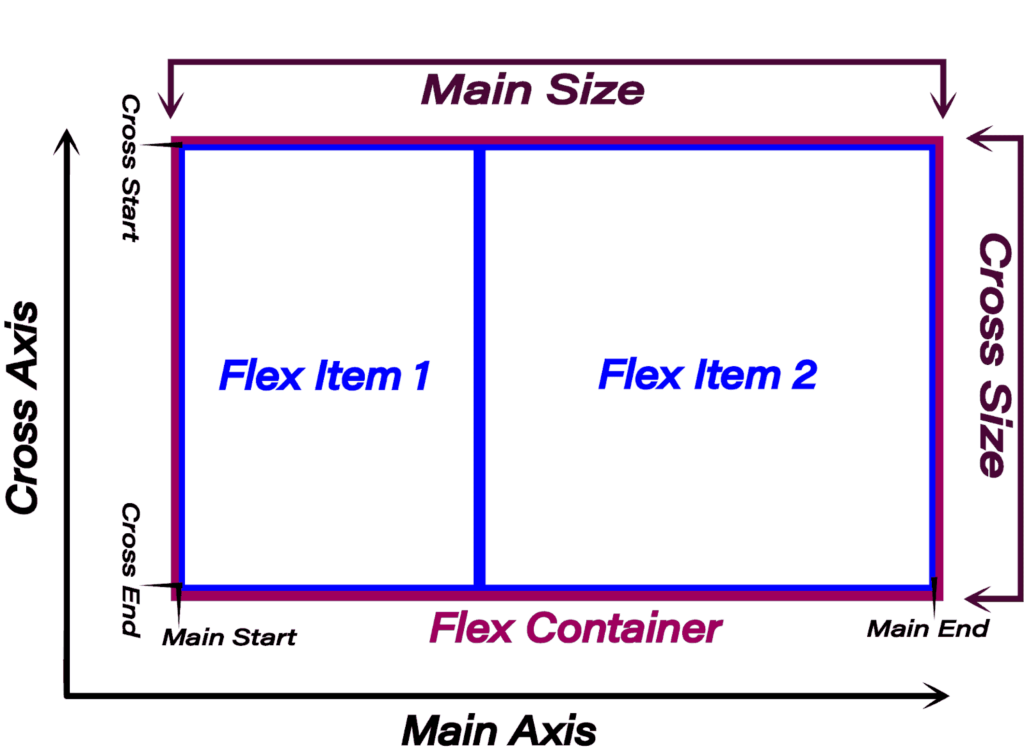
Still puzzled? Put it simply: with flex-direction: row or row-reverse, justify-content affects the horizontal alignment; otherwise, vertical.
So, in our case, it’ll affect the horizontal alignment. Using ‘flex-end’ will place the elements at the end, making the frog move on the lily pad.
Likewise, ‘end' does the same. The only difference:‘ flex-end’ is specifically for Flexbox, while ‘end’ is a general box model value, so it can be used in the grid as well.
Lastly, flex-direction: row-reverse flips the flexbox, which makes it fill the element from the right side.
Flexbox Froggy Level 2 Answer
Answer Code:
Explanation:
As I already told you, with flex-direction: row or row-reverse, justify-content aligns horizontally; otherwise, it’s for vertical alignment. So, here, this code will center both the frogs horizontally.
Flexbox Froggy Level 3 Answer
Answer Code:
Explanation:
Again, we have the justify-content property, and the value this time is ‘space-around’.
But what does this value do? See this:
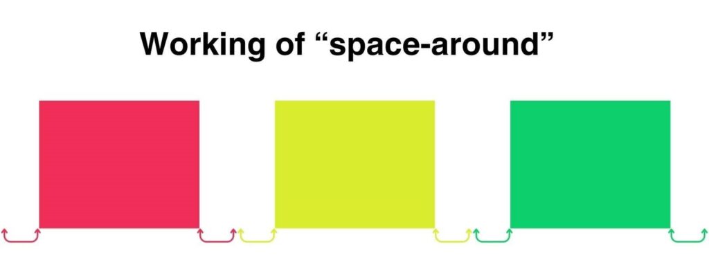
As seen here, the space is divided equally among all flex items, with half on each side.
But this makes the space between flex items twice as much as the space on the edges. So, if you want equal space everywhere, you can use the ‘space-evenly’ value.
Flexbox Froggy Level 4 Answer
Answer Code:
Explanation:
The ‘space-between’ value is much like ‘space-around’, but with no gap on the far right and far left edges.
Flexbox Froggy Level 5 Answer
Answer Code:
Explanation:
Unlike the justify-* properties, all align-* properties impact the cross-axis. The cross axis is the one perpendicular to the main axis.
So, in our case, the align-items property aligns the frogs vertically. Setting it to ‘flex-end’ or ‘end’ (general box model version) sends the frogs to the desired lily pads.
Flexbox Froggy Level 6 Answer
Answer Code:
Explanation:
Now, you know that, in our case, justify-content controls the horizontal alignment and align-items controls the vertical alignment.
So, setting both to ‘center’ will bring the frog to the center.
For the rest of the two variations, we essentially did the same thing but with the place-* properties.
The place-* properties are just a shortcut for both justify-* and align-*. So, setting place-items to ‘center’ sets both justify-items and align-items to ‘center’ at once.
Flexbox Froggy Level 7 Answer
Answer Code:
Explanation:
If you’ve read this far, you’ve got it. First, send the frogs to the bottom with align-items, then space them horizontally using justify-content.
Flexbox Froggy Level 8 Answer
Answer Code:
Explanation:
That’s a simple one—just change the flex-direction to ‘row-reverse,’ and the element will start from right to left.
Flexbox Froggy Level 9 Answer
Answer Code:
Explanation:
When we set flex-direction to ‘column,’ the elements align vertically and start from top to bottom.
Flexbox Froggy Level 10 Answer
Answer Code:
Explanation:
The first thing we observe is that we need to horizontally reverse the order of the elements. So we set flex-direction to ‘row-reverse’.
But it also moves the frogs to the right. We want them on the left. That’s why we can either set the justify-content to ‘flex-end’ or ‘start’. Let me explain.
The ‘flex-end’ is a flex-specific value, so it’s dependent on the flex-direction property. Like this:
| flex-direction value | flex-start position | flex-end position |
| row | left | right |
| row-reverse | right | left |
| column | top | bottom |
| column-reverse | bottom | top |
On the other hand, general box model values are independent. So they’ll always have the same effect.
Flexbox Froggy Level 11 Answer
Answer Code:
Explanation:
Here, the lily pads are arranged vertically, so we must set the flex-direction to either ‘column’ or ‘column-reverse’.
But ‘column-reverse’ will also change the order of the frogs, so we can’t use that.
And as I told you earlier, with the ‘column’ value, the vertical axis becomes the main axis (where justify-* affects). So, we’ll use ‘justify-content’ to push the frogs at the bottom side.
Similarly, we can also use the simple ‘end’ value for that.
Flexbox Froggy Level 12 Answer
Answer Code:
Explanation:
Again, with lily pads arranged vertically, change flex-direction to one of the column values, specifically ‘column-reverse’ due to the opposite order of lily pads.
Now, for spacing along the main (vertical) axis, set justify-content to ‘space-between’.
Flexbox Froggy Level 13 Answer
Answer Code:
Explanation:
This time, the lily pads are arranged horizontally but in the opposite order, so we know we need to set the flex-direction to row-reverse. Also…
They’re at the bottom, so we need to set the align-items to either ‘flex-end’ or ‘end’ (both will do the same thing here).
Finally, we want the frogs to align in the center horizontally. Therefore, we used justify-content: center.
Flexbox Froggy Level 14 Answer
Answer Code:
Explanation:
In a flexbox, flex items are arranged in the ascending order of their order. But by default, they all have the order 0. So they’re arranged in the order of their occurrence in the markup.
Therefore, by setting the order value of the yellow frog, it’ll move to the end and the rest two frogs will automatically be arranged on the proper lily pads.
Flexbox Froggy Level 15 Answer
Answer Code:
Explanation:
In this case, we just need to bring the red frog to the first. For that, we need to set its order to the least of all, which is -1 because all the rest have the value 0.
Flexbox Froggy Level 16 Answer
Answer Code:
Explanation:
Think of align-self like align-items, but it applies only to specific elements (here, yellow). And you already know that align-* properties affect the alignment along the cross-axis (here, vertical).
That’s why we set it to flex-end or end.
Flexbox Froggy Level 17 Answer
Answer Code:
Explanation:
First, as you can see, we need to push the yellow frogs to the end. So, we set the order value highest of all, which is 1 (as all others are zero).
Then we also need to push both of them to the bottom. Therefore, we used align-self because it controls the alignment along the cross-axis (here, vertical).
Flexbox Froggy Level 18 Answer
Answer Code:
Explanation:
After seeing two rows of lily pads, we get the idea that we need to wrap the flexbox.
So, when you set flex-wrap to ‘wrap’, when overflowed, those extra elements are put into a new row/column (depending on the flex-direction).
Then what’s the difference between ‘wrap’ and ‘wrap-reverse’?
In ‘wrap’, when the flex items overflow, the new row/column is created after the current track. While in ‘wrap-reverse’, it’s created before the current track.
Flexbox Froggy Level 19 Answer
Answer Code:
Explanation:
Since the lily pads are arranged vertically, we need to set flex-direction to one of the column values.
With the ‘column’ value, the frogs will start aligning from the top (the first green frog at the top). While with ‘column-reverse’ they’ll start from the bottom.
Also, we have multiple columns, so we also need to set the flex-wrap to ‘wrap’. This will put the overflowed frogs in a new row (after every five frogs).
Therefore, no matter if we start from the top or bottom, we’ll get the same arrangement.
Flexbox Froggy Level 20 Answer
Answer Code:
Explanation:
It’s the 19th level, but we need to use the shorthand flex-flow instead.
This shorthand simply combines flex-direction and flex-wrap together in the same order.
Flexbox Froggy Level 21 Answer
Answer Code:
Explanation:
The most important thing: the align-content only works when you have flex-wrap set to ‘wrap’ or ‘wrap-reverse’. And what does it do?
Well, it controls the alignment of the rows/columns along the cross-axis.
In our case, the cross-axis is the vertical axis. So, it’ll change the space between rows, and setting it to ‘flex-start’ or ‘start’ will move all the rows on the top.
Flexbox Froggy Level 22 Answer
Answer Code:
Explanation:
Same concept as level 21 but we need to align the rows at the end of the flexbox. So, we can use the value ‘flex-end’ or ‘end’.
Flexbox Froggy Level 23 Answer
Answer Code:
Explanation:
For a vertical layout, set flex-direction to either ‘column‘ or ‘column-reverse.’ If set to ‘column,’ it starts from the top, placing the first red frog at the top.
Thus, we used ‘column-reverse’.
Then we also need to align the columns in the center horizontally (along the cross-axis). That’s why we set align-content to ‘center’.
Flexbox Froggy Level 24 Answer
Answer Code:
Explanation:
Here as well, we need a vertical layout. But the first (red) frog should be placed at the bottom. Therefore, we set flex-direction to ‘column-reverse’.
Next, to form two columns, wrap the flexbox, ensuring the new column appears before (to the left of) the main column. That’s why we set flex-wrap to ‘wrap-reverse’.
Then, position those two columns at the extreme ends horizontally. Since flex-direction is set to ‘column-reverse,’ the horizontal axis is the cross axis. That’s why we used this align-content: space-between to achieve it.
Finally, to center the elements of the new (incomplete) column vertically (along the main axis), we set justify-content to ‘center’.
This will get us the desired placements.
So, that’s how you solve the complete flexbox froggy game. But is it the end?
My friend, it’s barely the beginning. Flexbox itself has more than 33 properties and 99+ values combined.
Therefore, I have two resources for you (one free and one paid).
- If you want to sharpen your flexbox skills more by playing games, you can play another fun game, Flexica and Islands, here for free.
2. If you’re still confused between different properties, their combinations, and exceptions in Flexbox and Grid, you can check out my ebook ‘Master Flexbox and Grid‘ for a thorough understanding.
Remember, becoming an exceptional developer requires deep understanding.
So, keep coding, keep exploring, and keep rocking the web!
