The navigation bar (aka nav bar) is one of the most significant parts of a website.
And making it responsive is even more crucial.
In this article, we’ll learn how to create a perfectly responsive navbar using simple HTML, CSS, and a little JavaScript.
But before moving ahead, here’s the table of content if you want to jump around:
How to Create a Responsive Navbar
Now don’t worry. I’ll not bore you with unnecessary details like “What is a responsive navbar” or “Why is it important”. I guess you already know all of that stuff.
Although I want to clarify one thing, I’m assuming you already have a basic understanding of the following CSS concepts:
- Basic properties
- CSS box model
- Flexbox
- Basic Media Query
- Click event in JavaScript
Okay, let’s first write the HTML.
HTML for a Responsive Navbar
Firstly, this is the example responsive navbar with a logo we want to create:
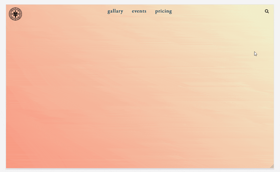
As you can see, here we have three parts: a logo, navigation links, and a search bar.
So in the HTML, we’ll create a main wrapper, and it’ll have three elements inside it.
An image for the logo, a nav for the 3 navigation links, and a search bar for the search input box and the search button.
Like this
Here, as you can see, I wrapped the navigation and search bar in an additional wrapper with the class mobileMenuWrapper.
It has no use on wider screens. But when the screen gets smaller, we’ll use it as the main menu container or background. It will cover the screen when the menu is opened.
And after the search bar, we also added another element (the <i> tag). It’s nothing but the hamburger menu icon that we’ll use from the Font Awesome website.
Similarly, we have another icon at the end (with the class hamburgerMenu). It’ll act as the hamburger menu icon on mobile screens.
This was all about the markup for creating a responsive navbar. Now let’s move on to the interesting stuff: CSS.
Adding the CSS
So the first thing we’ll do is make the header a flex container with the flex-direction set to “row” (which is the default value).
In Flexbox and Grid, only the direct children are considered flex items. In this case, there are two flex items: The logo image and the mobile menu wrapper.
To align these two elements at either end of the header with space in between, we’ll set the justify-content property to “space-between”.
However, note that we’re aligning the mobileMenWraper. This will move both navigation and search bar to the end. But we only want the search bar at the end, not the navigation.
So to achieve this, we’ll make the navigation’s position absolute and center it horizontally.
Additionally, to lay the links inside the navigation horizontally, we make the navigation container a flex container with the flex-direction set to “row”.
Here’s how:
And initially set the display for the hamburger to none (as we want it visible only on mobile screens).
So this was the main logic for creating a navbar for wider screens. But now we have to make it responsive for smaller screens as well.
Although, we also need to give some basic styling to all the elements. So I covered them in the next section, but if you want to skip it, you can directly go to the mobile menu part.
Basics CSS for the Navbar Elements
Firstly, we want to set a fixed size for the logo because it’s too big.
And here we’ll also set the mix-blend-mode to “multiply” because our logo image also has a background. This will make it blend with the body background.
Like this:
Here, the min function returns the minimum value out of two values.
On wider screens, 13vw will be bigger than 45px hence the height of the logo on wider screens will be 45px but on the smaller screens where 13vw is smaller than 45px, the height of the logo will be 13vw.
This will ensure that the height of the logo will not be too large on smaller screens.
And the width of the logo will be by default “auto”.
We’ll also give some other basic styling to the navigation links and hamburger menu icon, like this:
Coming to the styling for the search bar…
Firstly, remove the default styling for the searchInputBox and searchButton. Then make the searchBar a flex container so that the button and search input are laid horizontally instead of vertically.
Like so:
Okay, now the navbar is perfect for wider screens, let’s make it responsive.
Making the Navbar Responsive
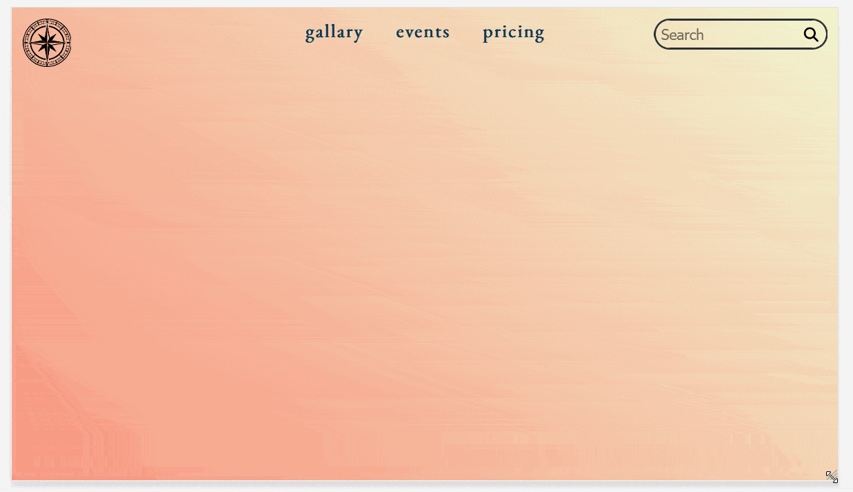
So currently the navigation bar looks like this:
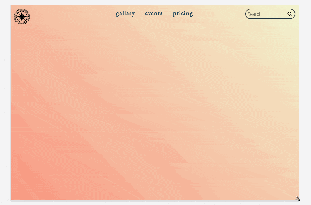
As you can see when we narrow down the viewport, the search bar starts to overlap with navigation.
That’s why on the smaller screens, we only want the logo and the hamburger menu to be visible. And when the user clicks on the hamburger menu icon, we’ll open the hamburger menu and show the navigation links and search bar inside it.
For doing that…
Firstly, we’ll set the display of navigation and search bar to “none” using media query and then make the hamburger menu icon visible.
Using this:
Now, on the smaller screens, we’ll have a logo on the left side and the hamburger menu on the other.
The next thing is to open the hamburger menu when the user clicks on the icon.
So for that, we’ll use JavaScript to detect the click and then toggle a class “clicked” on click:
What will this do?
Well, normally the mobileMenuWrapper has no class named “clicked” so when the icon is clicked, it’ll toggle that class. When the menu is opened, the class will be removed.
Now let’s use this clicked class to design the menu for the mobile screen.
Firstly, target the mobileMenuWrapper when it has the “clicked” class and then style it.
This will basically apply the CSS to mobileMenuWrapper only when the icon is clicked.
So make it a flex container with flex-direction set to “row” as we now want to display the navigation links and the search bar vertically.
Then set its position to “absolute” with its top, right, bottom, and left all to zero so that it covers the whole screen when the menu is opened.
Also, give it some basic styling like this:
But we have a problem.
When the icon is clicked, the hamburger menu will open and cover the whole screen. But still we can can scroll the body.
Hence, to avoid that, we’ll also toggle a class for the body using this:
Then target that class and set its overflow to “hidden” like this:
This problem is solved.
On the hamburger menu, we want the navigation links to be laid vertically, so let’s target the navigation when the menu is clicked and make it a flex container with flex-direction set to “column”. Also, we’ll need to set position to “relative” because in mobile version, it was set to “absolute”.
Now the only thing remaining is searchbar.
Previously, we’ve set its display to “none” inside the media query. Therefore, to make it visible, we’ll set it to “flex” and some other basic styling like this:
Until this point, the navbar looks like this:
Extra Improvements
Although it looks almost perfect, it needs three minor improvements:
- We need to turn the hamburger icon to a cross mark when the menu is opened.
- Initially, only display the search icon. Show the full search bar with animation only when the user hovers over it.
- We can also add a 1s transition to the hamburger menu.
For changing the icon, we just need to toggle these two classes:
Here, the fa-xmark class is a Font Awesome class for the cross mark and the fa-bars class is for hamburger menu icon.
When the menu opens, it will remove the "fa-xbars" class and add "fa-xmark". When it closes, it will remove "fa-xmark" and add "fa-bars".
For the searchbar, initially remove the border and set the input box width to 0. Show them only when the searchbar is hovered.
Lastly, add the transition to menu like this:
That’s it. That’s how simple it is to create a perfectly responsive navigation bar just using HTML, CSS and a little JavaScript.
And you might have already realized the important role that flexbox played here. So, if you want to grab my free ebook “21 Clever Tricks Using Flex & Grid”, you can download it here.