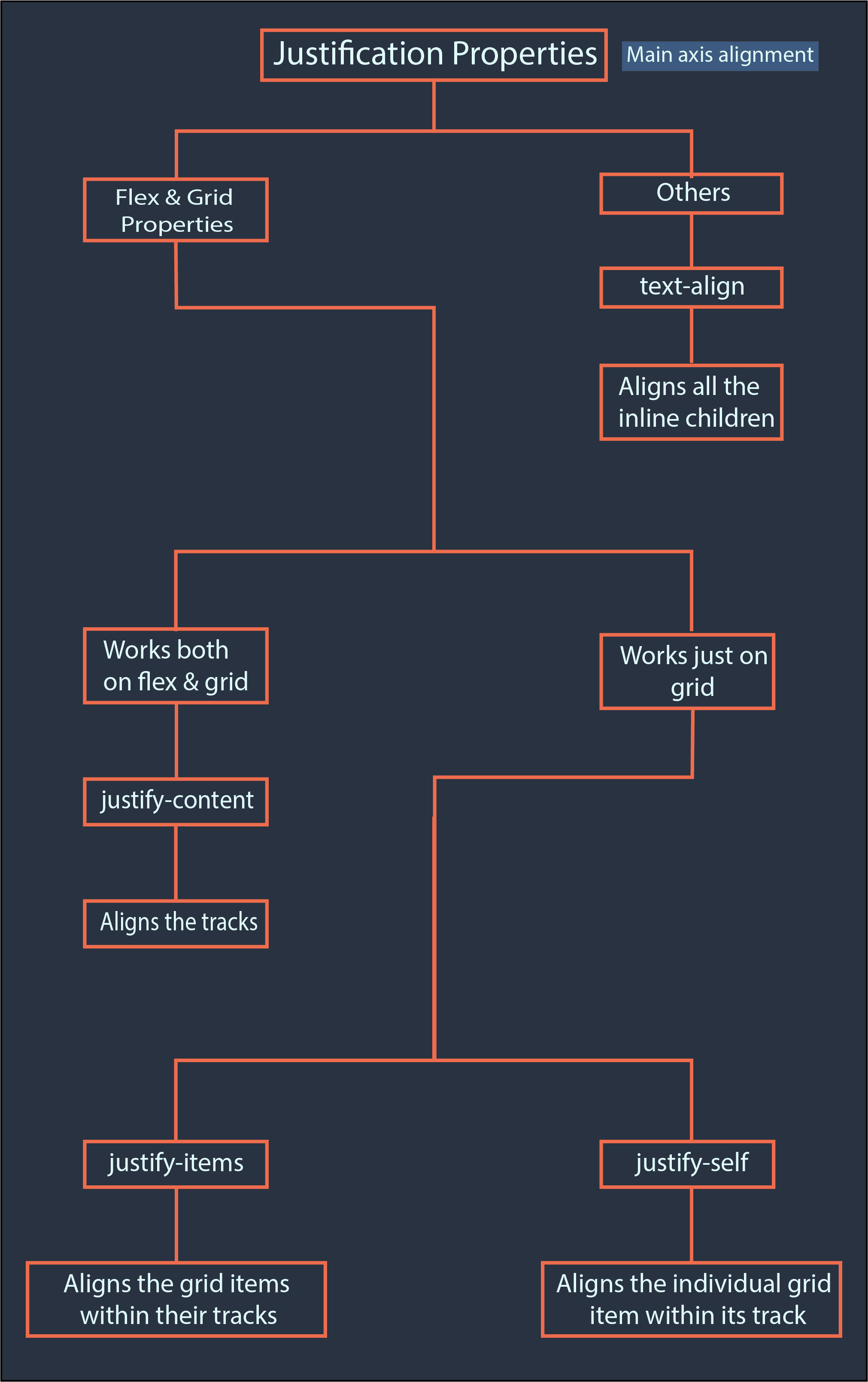
| Hey, it’s Utsav. Whenever I talk about Flex and Grid, I’m asked about the difference between these 4 properties: text-align justify-content justify-items justify-self Actually, they also include these four properties: align-content align-items align-self vertical-align But in this email, we’ll discuss the justification properties (the first four). The remaining 4 in the subsequent email, as this one would otherwise become too long. These four properties can be divided into two categories. Ones that are unique to Flex and Grid, and others. So, the latter three properties (aside from text-align) are flex and grid specific, while text-align could be used even without them. Let’s first talk about the text-align property. Don’t worry, it’s the easiest one. It simply controls the horizontal alignment of inline elements within the container. Whether it’s text, a div with an inline display, an image, or any other inline-level element, text-align works for them. Coming to the flex-and-grid-specific properties. Out of the three, justify-content and justify-items work on flex and grid containers, while justify-self works on the items. To be specific, justify-content works on flex and grid containers, while justify-items works solely on grid containers, and justify-self is specific to grid items. And $[UD:FIRST_NAME||]$ the first thing you should understand is: Every justify-* property controls the alignment on the main axis. What’s a main axis, Utsav? You must be asking. The main axis refers to the axis along which your flex or grid is laid out. In a grid, the main axis is always horizontal, and the cross axis (opposite of the main axis) is the vertical axis. While in a flexbox… It depends on the flex-direction value. If it’s row or row-reverse, the main axis will be the horizontal axis. Otherwise, it’ll be the vertical axis. Also, note that these axes also depend on the writing mode, but I don’t think we need to dive deep into that much details. (Let me know if you want to know about that.) Let’s go back to the properties. So, these three properties control alignment on the main axis. Therefore, in both flex and grid containers, the justify-content property controls the alignment of the content (aka tracks) along the main axis. Remember that justify-content affects entire rows or entire columns, without affecting specific items. As for the justify-items property… It applies solely to grid containers, not flex containers. Therefore, using it, you can control the alignment of grid items within their tracks along the main axis. Finally, the justify-self property. It exclusively works on grid items or elements within a grid. It’s similar to the justify-items property, but it affects the specific item to which it is applied, rather than affecting every single one of them. To summarize this email, I created this illustration: |
 |
That’s it for this email. See you in the next one! 🙂 |